Drawer
A drawer is a panel that slides in from the right side of the screen.
It is often larger than a modal, which makes it a preferable choice when the content is too extensive to fit within a modal.
const FooterWrapper = styled.div` display: flex; flex-direction: row; gap: ${Metrics.normal}; justify-content: flex-end; position: absolute; bottom: 0; width: 100%; padding: ${Metrics.normal} ${Metrics.xlarge}; box-shadow: 0px 6px 20px rgba(0, 27, 102, 0.05); background: ${Colors.background.container}; ` function App () { const [isOpen, setIsOpen] = React.useState(false); const actions = [ <Button variant="secondary" onClick={() => { setIsOpen(false); }} text="Cancel" size="large" />, <Button variant="primary" onClick={() => { setIsOpen(false); }} text="Save" size="large" />, ] return ( <> <Button onClick={() => setIsOpen(true)} type="button"> Open drawer </Button> <Drawer backButtonLabel="Close drawer" onClose={() => setIsOpen(false)} isOpen={isOpen} headerActionSection={<Button variant="tertiary" icon="bulb">Need some help!</Button>} > <h1>I'm a drawer content!</h1> <FooterWrapper> <Button variant="secondary" onClick={() => { setIsOpen(false); }} text="Cancel" size="large" /> <Button variant="primary" onClick={() => { setIsOpen(false); }} text="Save" size="large" /> </FooterWrapper> </Drawer> </> ); } render(<App />)
Anatomy
A drawer consists of the following elements:
- A header
- Content
- Optionally, a footer with action buttons
Header
The header includes a back button to close the drawer. Actions are optional.

Since the header has a fixed width, it cannot accommodate many action buttons. If more than two actions are needed, consider using a "three dots" menu button:

Content
The content is the main section of the drawer and can vary:
A table with a big title:
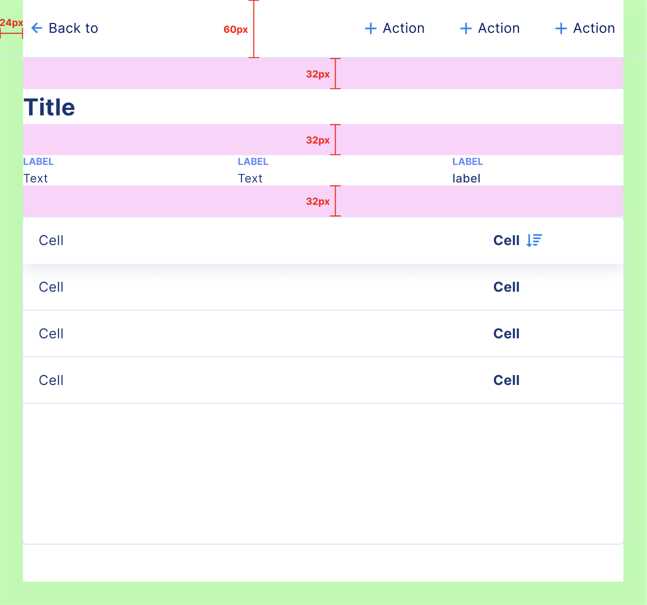
Below the title, you may find a small list of key values and a table.
Frequently, a more extensive list of key values precedes the table. In such cases, we can integrate the title within the layout of the key-values grid:
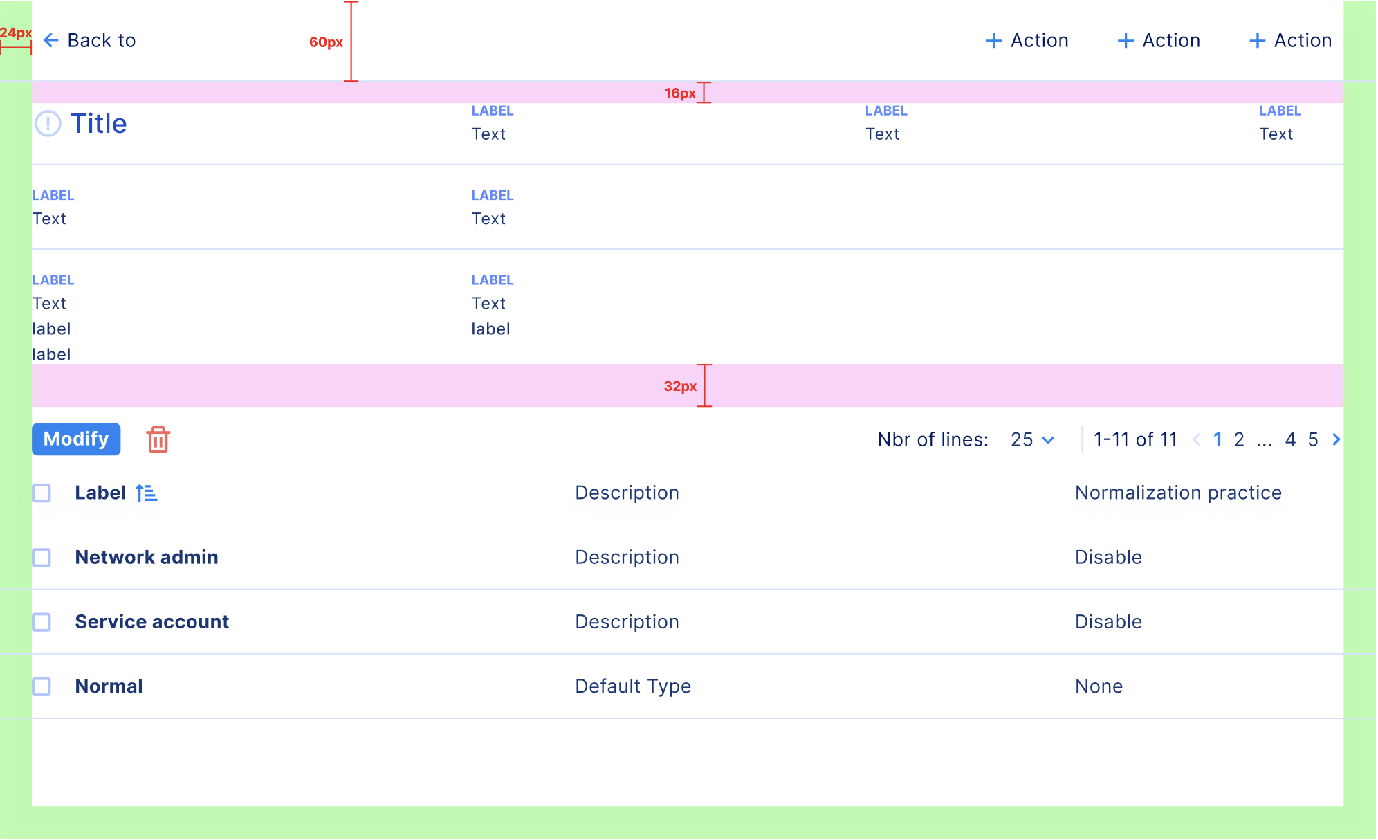
Drawers are also used to display large forms or complex data.
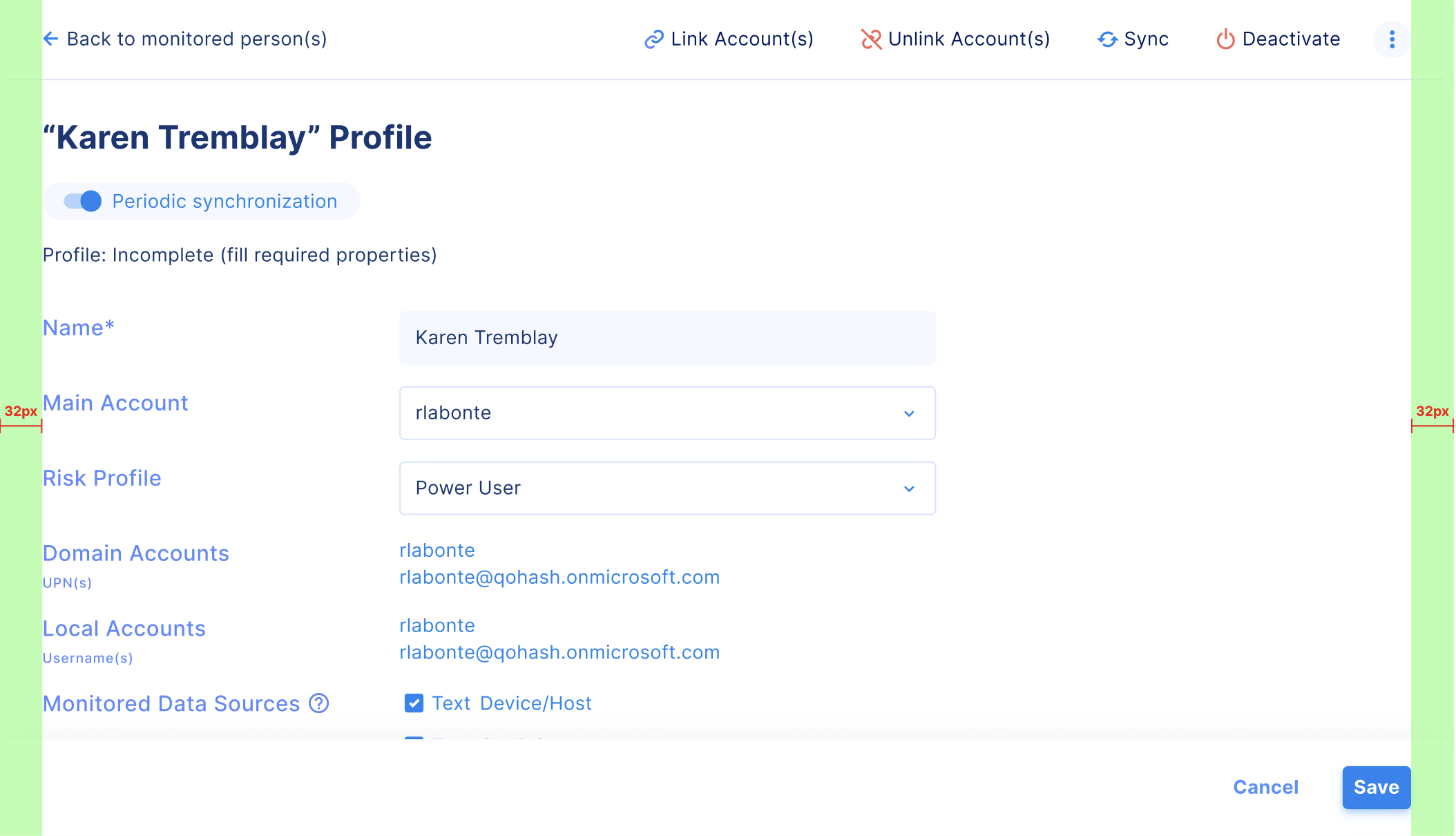
Footer
The footer, which contains action buttons, is optional and typically used when the drawer includes a form.

Margins
When the drawer features a form, apply a 32px horizontal padding. Otherwise, maintain a 24px padding.
Tables that feature actions or pagination should align with the edges of the drawer.