Modal
Modals are used to display content in a layer above the rest of the page. They are often used to display contextual or additional information, or to solicit user input.
Typically, modals are employed to:
- Display additional information
- Solicit user input
- Confirm actions
- Show messages (e.g., error, warning, success)
Modals also prevent any user interaction with the underlying page until they are dismissed.
Modals can be closed by clicking the close button, pressing the escape key, or clicking outside the modal, depending on the modal's importance.
Code Editor
function App () {
  const [isOpen, setIsOpen] = React.useState(false);

  const actions = [
    <Button variant="secondary"
      onClick={() => {
        setIsOpen(false);
      }}
      text="Cancel"
      size="large"
    />,
    <Button variant="primary"
      onClick={() => {
        setIsOpen(false);
      }}
      text="Save"
      size="large"
    />,
  ]

  return (
    <>
      <Button onClick={() => setIsOpen(true)}>
        Click to open the modal
      </Button>
      <Modal
        title="Title"
        isOpen={isOpen}
        onClose={() => setIsOpen(false)}
        actions={actions}
      >
        Content
      </Modal>
    </>
  );

}

render(<App />)
Anatomy
A modal consists of the following elements:
- A header that includes a title and a close button
- Content
- Optionally, some action buttons
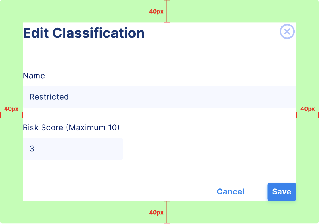
Modal with an action
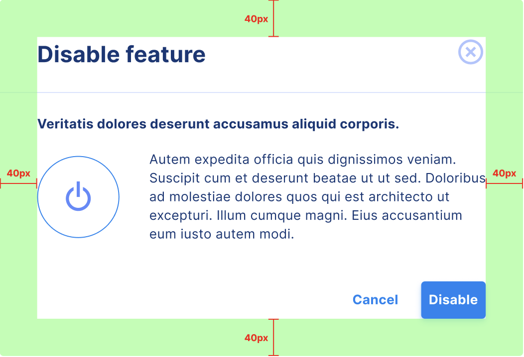
Modal with user input