Page
A page is the largest structuring element in the design system.
Anatomy
There are several important elements in a page but they generally follow the same structure below:
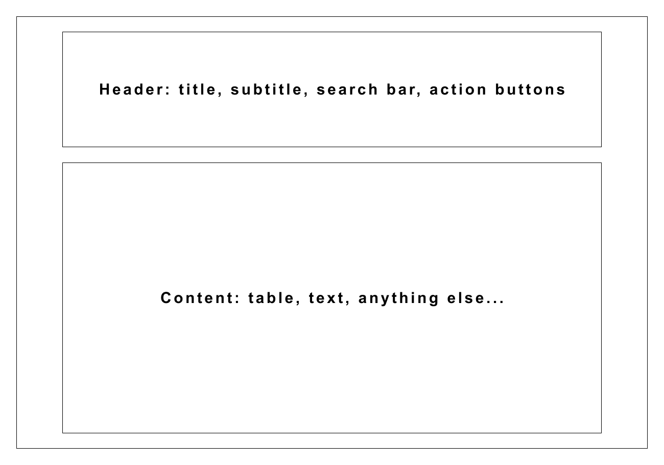
There are some exception though, because this template is not the best the present data for every section in an application.
Remember that it's a guideline and not a strict rule. For example, a dashboard is not meant to have a header, but it's still a page!
Header
The header contains a title. Optional elements are a description and actions.
<PageTitleDescription
  title="Hey"
  description="This is a description for the page header"
  actions={[
    <Button size="large" onClick={() => window.alert('HEY')}>Say hey!</Button>
  ]}
/>
Sub navigation
When there are too elements things to present on a page, it's a common idea to split them into several parts.
That's why we can use tabs to switch between those parts but staying in the same parent page.
const StyledTabPanel = styled(TabPanel)`
  margin-top: ${Metrics.normal};
`;
StyledTabPanel.displayName = 'TabPanel';

render(

<>
  <Tabs variant="secondary">
    <TabList>
      <Tab>SSO</Tab>
      <Tab>Email</Tab>
    </TabList>
    <StyledTabPanel>
      <PageTitleDescription
        title="Azure SSO Configuration"
        description="Manage SSO configuration."
      />
    </StyledTabPanel>
    <StyledTabPanel>
      <PageTitleDescription
        title="Email configuration"
        actions={[<Button size="large">Test</Button>]}
      />
    </StyledTabPanel>
  </Tabs>
</>
)
Margins
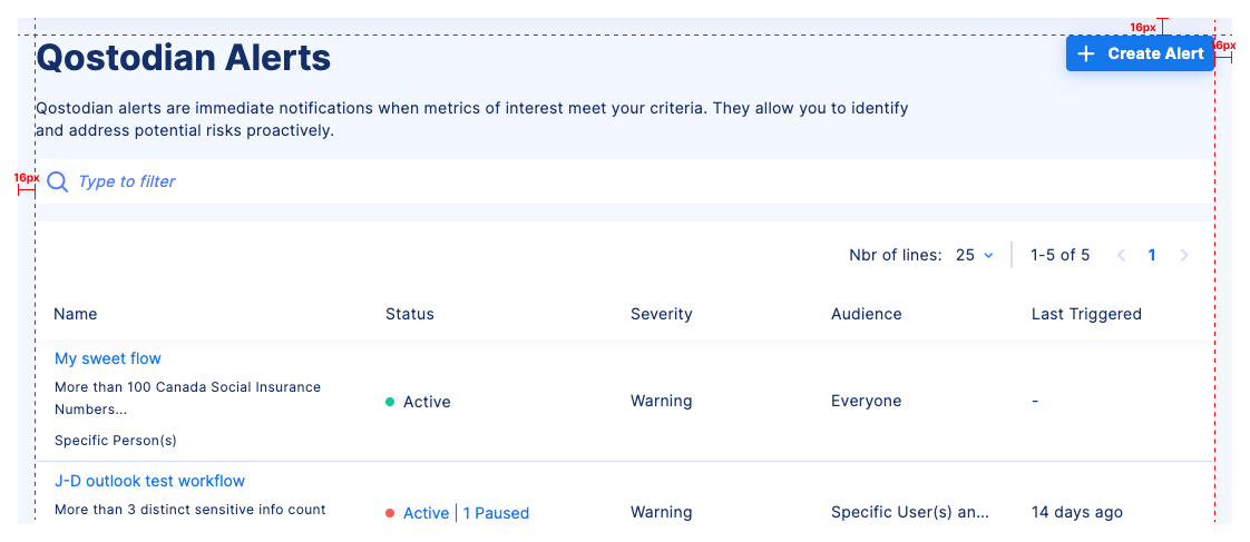
The margins in a page take 16px.
Colors
Background
The page background is [calculating...]. This impacts on the choice of colors for the content in the page.
Indeed, the contrast ratio between the background and the content should always be sufficient to ensure a good readability.
That's why we need to use color variants depending on the parent container background. This is true when using Cards, for instance.
One recurrent pattern is to use a SearchBar at the top of a page. But since the default search bar background is [calculating...],
you have to use the right background for the search input.
<>
  <PageTitleDescription
    title="Hey"
    description="This is a description for the page header"
  />
  <SearchBar background="white" placeholder="Search for something..." />
</>
Cards
Cards have a white background.
const CardWithPadding = styled(Card)`
  padding: ${Metrics.normal};
`;

render(

<CardWithPadding>Hey</CardWithPadding>
);
They are used when we want a proximity between related elements. For example, a search bar and filters.
